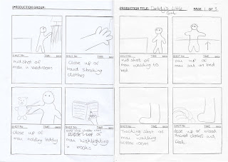
Here is my personal evaluation for the production; "Daddies Little Girl".
The brief we used was
"To Produce the Opening Sequence of a New Thriller including titles aimed at a 15/18 Certificate Audience, approximately 2 minutes in length".
For this task I was placed in a group with
Laura Henshaw
Joe Mackeown
and Amy Llewellyn.
Before we could start to work on our actual project, We were given two different Tasks to Record & Edit, these were "Someone Tying a Shoe" and "Someone Walking into a Room". We could make them as interesting or a mundane as we liked, but they had to cover the Breif. Then we had to edit them using Adobe Premiere Pro, and show them to our peers where they would give feedback on good/bad point and what we could have done to improve on it.
It was only after we had done this task that we could move on to our actual project and get underway with in.
In what ways does your media product use, develop or challenge the forms and conventions of real media products?
In preparation for the actual project, We watched a selection of Thriller Openings both in class, and for homework. The Thriller Sequences that I watched were "Seven", "Jaws", "Silence of the Lambs", "Armageddon" and "Deja Vu". One thing that these thrillers made us of was Techniques that would drag the audience in, and make them want to watch on. The Directors did this by using techniques such as "Conceal and Protraction" where the audience is only shown part of the action, for example, The result of a murder; such as a dead body or a disgraded weapon. Another technique favoured was the use of the "Question & Answer Model"; this is where the audience are shown something, or shown something from a certain Camera Angle or Point Of View to make them ask Questions about the film, making them want to watch on to discover the answers.
Moreover, Camera Angles such as close ups were a key feature also, as they didn't show the whole item or scene, which helped add to the suspense and increase the use of the two Thriller Techniques mentioned above. High Angle and Low Angle shots were made use of too to denote one characters strength over another; such as when a killing was about the take place the Point of View, or Camer Angle, would be looking down onto the Victim making them appear smaller and more vulnerable.
In Addition, Eeiry sounds, of a changing pace helped add to the tension on a more subconcious level, where as the graphics were always eye catching in there own way, be that flashing around the screen or in a big, bold font in the middle of the screen.
For Our Thriller production, We, as a team, decided to make a Phsycological Thriller . This was because for our preparation for the work we produced a Questionnaire for people of our age to fill in; this would be beneficial as we would be able to see what type of Thriller best appealed to them, whilst also seeing what features made it more enjoyable to watch, as well as what didn't.
We decided that from the Questionnaire, we knew people of our age group wanted most a Phsycological Thriller, which involved a Man as the bad guy or killer. They thought bassy and slow sounds best suited the genre, as did red coloured fonts.
On the other hand, having viewed the Thriller previous to this study, we thought it best to use black, bold titles with a red shadow, so we kept our audiences opinion to go with what they thought best, whilst using the more common style, or a bold, black font, adopted by the Hollywood Blockbusters.
However, for the rest of the films techniques, we combined what we thought to be a good mix of Techniques used in the films we had watched during lessons. We were going to make use of the "Conceal & Protraction" Technique, hence making our other decision of using the "Question & Answer Model" and obvious one to make. We struggled however to see how we could "mask" the face of our killer by keeping his face out of shot, so we had a difficult task of making the Audience ask Questions whilst already know the identity of the killer; a Key Point, in which We ignored the results of our Questionnaire.
Our Thriller, entitled "Daddies Little Girl", used a variety of Camera Angles such as "Low Angle Pan" and "Close Up" as well as "Tracking" and "Panning". We wanted our Camera Angles to give a sense of fear to the Man shown in the majority of the footage. We made use of Low Angle shots so that he appeared taller and far more supperior to instill a sense of fear into our audience, so they knew this man was not doing normal day to day activities.
The Close Up shots were few and far between, as when We used them they were to highlight a point; such as, When he is in the Bedroom, he is stroking clothing, Why would you do that? When he is in the kitchen with the knife, the Close Up shot makes the knifer appear larger and longer; making the shot where he chops the tomato appear more menacing and less normal.
The Panning shots worked best when the Girl entered the film; this was because it made it look like the was being watched and followed by someone in the background. The High Angle shots gave the same effect, making her look smaller as well as it looking like somebody was watching in on her through a Device such as CCTV; again intesifying the audience, increasing tension and fear.
On the whole, I believe our Thriller is a good opening Sequence, maybe not as good as it could have been with more thoughtful planning, and a better understanding of how it would appear when it was compiled at the end. Our music fit in well with the film, as it was bassy and suspensefull whilst the man was moving around the house, and then eeiry and disturbing when the girl came in, and it built up towards the end as the Girl approached her bedroom door; it then stops just as she opens it, this leaves the audience feeling confused, and left in a false sense of Security. The footage leaves the audience asking Questions such as "Who is this Man?", "What is he doing?", "Is he in his house or somebody elses?" which means we achieved our aim of uitilizing the Question and Answer Model.
So because of this, I think this shows how a Phsycological Thriller, with a constant undertone of death or murder doesn't have to be set in a rural wooded area, with a Person walking home in an unrealistic situation, so I think our Thriller is a good example of how an Opening Sequence should or could look like. We used a variety of Techniques such as the Transformed City, making a normal place full of danger, as well as uitilizing the Question & Answer Model by using a variety of Camera Angles specifically used for that effect.
Further Good points about our film is the Editing, where we made use of Video Effect to layer 3 shots over each other, to show a passing of time as he is clearly able to move freely around the house. We slowed down the tomato slicing shot to add impact as the bang is stretched out over a longer period of time. Match on Action was a technique used, where we compiled severl clips back to back to show the Girl walking through the house to give the impression to the audience she is not alone, someone is watching her, and its all about to go terribly wrong very soon.
How does your media procuct represent particular social groups?
Our film shows the representation of how many girls are subject to Violence and Fear through their lives by members of their own family, as is shown in our Film. It also represents how Fathers who appear normal, and to be doing normal things can be very sinister and some times insane, as also shown in our picture. We took the idea of making every day activities that would appear normal, be infact quite sinister. This would make the audience feel insecure and reminds them of what it is a small proportion of people go through during their lives.
As is usually the case with these stories, We decided the Man would have to be the "Bad Guy" and the Girl would have to be the innocent Victim who has fallen foul of his behaviours; and we can emphasize this by using Camera Angles to make the Man appear stronger than her, when infact he is probably not.
What kind of media institution might distribute your media product and why?
Our film would definately be a Small Budget Blockbuster, that would make it to a Local Mainstream Cinema such as the Odeon in Warrington. Here we would be hoing to attract the attention of 15/16 Year olds, which is the Mode age of people we asked. On the other hand, it could also attract the attention of Thriller Fans outside of this target age, meaning people from the ages of 17 and up may come to see our film. After its time on the big screen, depending on its popularity and profit, it could be Released on DVD for a consumer to buy off the shelf in a Supermarket or DVD Rental Store to watch at home at the leisure.
The process of moving the Film from Cinema to DVD is now an easy one, although the burining and labelling of DVDs does take some time. However, in contrast to this, if we began the production of DVD's well before it left the cinema, we could have a low amount of stock on the shelves not long after it has left the Mainstream Cinema, meaning people who didn't get a chance to see it can watch it at home, whilst the Films Names & Reviews are still recent and being talked about.
As previously mentioned, our target audience is 15 year olds; this is becuase at our age of 16 and 17, we cannot legally watch a Film with an 18 Classification, therefore it was the most logical, (and only choice!), to make a Film with a 15 Classification, so we tried to make sure the people we Surveyed were in that age bracket. However, by making the film a 15 Certificate, it allows for anybody over the ages of 15 to go and see it legally, whereas if it was an 18, only people aged 18 and over could go and see it; so by making it a 15, more people can go and see it.
How did you attract/address your audience?
We knew what would best appeal to our Audience, because we had their preferences all written down in our Results from the Audience Research Questionnaire we carried out. We had our Questionnaire consist of 20 different Questions that covered topics from Favourite previous Thrillers, to the preferred Sex of the Killer, as well as What Style of Thriller that they liked best, What Sounds made a Good Thriller; Eeiry, Slow, Bassy etc.
By doing this we could gain a good idea of what our Target Audience expected from a Thriller, so we could gauge a good storyline, and take on the right actors and actresses to fill each role. Then we knew how to edit it, what sounds to add so our Audience felt a rise in tension as the Sequence progressed, and little details such as Fonts and Font Colours so we knew what little additions helped to make a Thriller for our Target Audience.
Our target Audience watched our film during post production, and commented on how effective the sounds were, although it may have been a little too overpowering. They enjoyed the opening as they were asking Questions such as "Whats he doing?" meaning we were succeeding in making effective use of the "Conceal & Protraction" and "Question & Answer Model". They didn't particularly comment on the colour of the graphics, which I believe is down to us still incorporating the Red Shadow behind the black font; which in the end looked quite effective!
What have you learnt about Technologies from the process of constructing this product?
Having previously done filming projects, I was quite familiar with Adobe Premier Pro, so the Software was not an issue; although We filmed some preliminary clips to freshen up on Editing etc. The Camera was quite hard to use because when it started recording, it wound back a little; meaning we needed to record 5 Seconds before acting so We didn't lose our footage as we didi with one of the Preliminary Films. In addition to this, the Camera had to be kept incredibly still and level, which was fine when we had shots using a tripod, but when it came to Panning Shots the Camera Work becomes a bit jumpy.
During the filming process, we didn't have problems as such, it was just anynoise in the background was easily heard; so when we came back to edit to find talking could be heard in the background, we had to go back to the Filming Location and Re-Record our previous footage.
As the film was taking place in a house we hadn't anticipated problems with space, i.e. fitting the tripod into certain places, and nor had we considered Lighting, and how it would differ between rooms in the house. There is a clear example of this during the Bedroom Scene where the lighting between shots is inconsistent and at times a little dim.
The Final Production does differ to what we put on the Storyboards, because whilst on Location filming, we saw some opportunities and had ideas for extra pieces that would make the Film better and more suspenseful. These changes included Recording the Man going through the Kitchen 3 Times so we could layer it as a multi-clip scene. We also decided to do the Tracking shot of just the girls feet along the floor so it gave her a sense of feeling bigger as though she couldn't fit onto the small Screen. This would then break the idea of her being a more vulnerable Character.
During & After filming we didn't reall struggle with Technological Problems, the onlyproblem we did have was on the first day of filming the battery ran out on the Camera, and there was no charger in the Box, so we had to resume Filming later that week.
Sound was our biggest problem; this is because it HAD to be Royalty Free (Free of Copyright etc) And finding a piece that suited the film was a near impossible task. However, in the end we found a Royalty Free MP3 Website called http://www.incomptech.com. Here they had a whole libary dedicated to sounds that We could utilize! After that the only problem we had with the sounds was keeping the Levels at a Normal State, and making sure it matched with our Action on Screen, and was long enough to last the 2 Minutes Required.
Camera Shots that were difficult included the ones where the Tripod needed rotating, this was because the Tripod when slackened off and tightened was very jumpy and creeked when it got so far round, so we had to look at using these shots a little less so's to avoid the background noise, which we couldn't even blend in to the film as it was inappropriate for the film.
In the film a variety of effects have been used; We spent a lot of time going through our film to decide where we could add Special Effects that would improve the film and not just make it look tacky. We slowed down the shot of the tomato being sliced as we thought this looked effective, and by dragging the clip out made it appear more menacing, instilling a greater fear in our audience. Our Graphics were simple yet effective, and as mentioned were Big, Bold & Black, surrounded by a Red Shadow.
The effects on Premiere were not as sophisticated as Programs such as Acid, which is used by the BBC and such, but it did the job of editing our film nicely. The effects on the whole were quite poor, but we utilized features such as the Scene Speed to slow down clips, and speed up others. The graphics were easy to create, and even easier to work with onscreen.
Looking back at your prliminary task, what do you feel you have learnt in the progression from it to the full product?
To conclude, since recording the Preliminary Videos of the "Walking Through The Door" Task, I believe my skills on both Camera & Editing have come on leaps and bounds. I am now able to confidently use a Camera Effectivley to draw the Audience in. I am able to edit what footage I have to make "Match-on-Action" so that several different shots can be strung together to make what is on long looking shot from several different angles along the way.
I believe looking at our film that we have met the brief, Our Film is of a Good Quality with near perfect editing between shots. We used Match-On-Action and Point of View Shots. The soundtrack to which we have used is good also, it matches what the Audience sees perfectly, there is a Bassy and Creepy sound at the begininng whilst the Man is rummaging around the house, and when the Girl comes in we have another instrument come in, and the music sounds more eeiry and begins to build up, increasing tension through the audience.
If I was to do this film again, I would keep the same sound track, but I would like to re-record the footage so the Identity of the man is kept secret building suspense through the Audience, this would make them want to watch on, whereas some may turn off after seeing the Killer Identity. I would change the graphics to a more suitable font to the film, I did try to produce graphics for the film on Adobe Photoshop, but when they were put onto the film they weren't as effective, so they got discarded.
Tuesday, 28 April 2009
Section 11: Audience Feedback
For our Audience feedback, we created a questionnaire consisting of 10 questions about various aspects of our Thriller, as follows:
1)Did you enjoy the storyline?
2)Did you like the camera angles?
3) Where the characters believable?
4) Did the graphics set the scene?
5) What was you favourite part of the film?
6) Was the little dialogue appropriate?
7) Did the music build suspense?
8) What was your least favourite part?
9) Was the storyline easy to follow?
10) Was the flashback useful to the story?
We got a group of people to watch our Thriller and fill in this questionnaire, the results we as follows :
1)Did you enjoy the storyline?
Yes- 17
No- 3
2)Did you like the camera angles?
Yes- 19No- 1
3) Where the characters believable?
Yes- 18
No- 2
4) Did the graphics set the scene?
Yes- 15
No- 5
5) What was you favourite part of the film?
Cut tomatoe,
drawing in book,
daddys home dialogue,
kitchen scene
6) Was the little dialogue appropriate?
Yes- 17
No- 3
7) Did the music build suspense?
Yes- 16
No- 4
8) What was your least favourite part?
Walkin through the house,
ending,
shakey shots,
flashback.
9) Was the storyline easy to follow?
Yes- 17
No- 3
10) Was the flashback useful to the story?
Yes- 8
No- 12
Our feedback shows that the majority of people enjoyed the storyline, finding it easy to follow, and the camera angles used. We found that most people thought that our graphics were appropriate and set the scene and the characters were believable. We also found that our choise of music was effective and people thought that our small peice of dialogue was apropriate. The most popular part of our thriller appeared to be the kitchen scene, especially the idea of cutting the tomato and also the idea of drawing/highlighting in the book. The least popular part of our thriller was the end, the scene with the girl walking through the house.
1)Did you enjoy the storyline?
2)Did you like the camera angles?
3) Where the characters believable?
4) Did the graphics set the scene?
5) What was you favourite part of the film?
6) Was the little dialogue appropriate?
7) Did the music build suspense?
8) What was your least favourite part?
9) Was the storyline easy to follow?
10) Was the flashback useful to the story?
We got a group of people to watch our Thriller and fill in this questionnaire, the results we as follows :
1)Did you enjoy the storyline?
Yes- 17
No- 3
2)Did you like the camera angles?
Yes- 19No- 1
3) Where the characters believable?
Yes- 18
No- 2
4) Did the graphics set the scene?
Yes- 15
No- 5
5) What was you favourite part of the film?
Cut tomatoe,
drawing in book,
daddys home dialogue,
kitchen scene
6) Was the little dialogue appropriate?
Yes- 17
No- 3
7) Did the music build suspense?
Yes- 16
No- 4
8) What was your least favourite part?
Walkin through the house,
ending,
shakey shots,
flashback.
9) Was the storyline easy to follow?
Yes- 17
No- 3
10) Was the flashback useful to the story?
Yes- 8
No- 12
Our feedback shows that the majority of people enjoyed the storyline, finding it easy to follow, and the camera angles used. We found that most people thought that our graphics were appropriate and set the scene and the characters were believable. We also found that our choise of music was effective and people thought that our small peice of dialogue was apropriate. The most popular part of our thriller appeared to be the kitchen scene, especially the idea of cutting the tomato and also the idea of drawing/highlighting in the book. The least popular part of our thriller was the end, the scene with the girl walking through the house.
Section 10: Video Log Sheets & Edit Decision Lists
Section 9: Production Schedule
Production Schedule
Film Title: "Daddy's Little Girl"
Director: Laura Henshaw, Amy Llewellyn, Ian Austin, Joe Mckeown
Producer: Laura Henshaw, Amy Llewellyn, Ian Austin, Joe Mckeown
Client:
Date Production Started: 3rd December 2008
Treatment Started: 20th November 2008
Storyboard Started: 26th November 2008
Shooting Started: 2nd December 2008
Post-Production: Completed (December 2008)
Rough Cut Submitted:
Final Show Tape Completed: December 2008
Location Equipment Required
Camera
Microphones
LightingKit
Tapes
Transport Requirments
1x Car for Crew
1x Car for Cast
Crewing Requirements
CameraPeople: Laura Henshaw, Amy Llewellyn, Ian Austin, Joe Mckeown
Sound: Laura Henshaw, Amy Llewellyn, Ian Austin, Joe Mckeown
Lighting: Laura Henshaw, Amy Llewellyn, Ian Austin, Joe Mckeown
Post Production Assistant: Laura Henshaw, Amy Llewellyn, Ian Austin, Joe Mckeown
Actors
Ray Hallam
Lisa Hardman
Props
Teddies
Knifes
Clothes
Section 8: Story Boards
Section 7: Location Sheets
Living room.
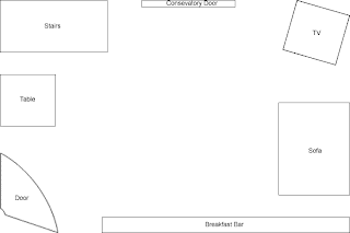
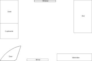
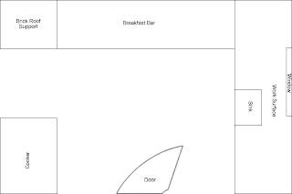
Name of Location: Laura's Living room.
Health and Safety: Stairs, Low roof where stairs go up.

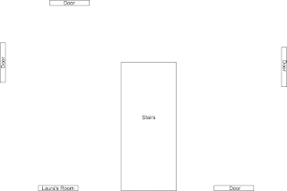
Landing.
Name of Location: Laura's Landing (upstairs)
Health and Safety: Stairs, door hinges.

Bedroom.
Name of Location: Laura's Bedroom.
Health and Safety: Cables / objects on floor.
Name of Location: Laura's Bedroom.
Health and Safety: Cables / objects on floor.

Name of Location: Laura's Kitchen
Health and Safety: Slippy surface from sink, Sharp objects, hanging pans.

Section 6: Character Outlines & Script
Character 1 - The Killer
Clothes
Normal Casual Clothes
Leather Gloves
Props
Things in the Bedroom
Clothes
Books
Teatowels
Knife
Character Outline
Derek Hunt is a 50 year old man, of middle height from Manchester. He has very little hair and is a quiet a man who prefers to be alone.He is a very clever man and leaves very few pieces of evidence at a crime scene; the evidence he does leave behind is not helpful to solving the case.
Derek has 4 daughters but none of them know he is their father. The children he has all have different mothers and do not know about each other. Most of the children have not seen their father since they were born or if at all. Derek recently came out of a mental institute due to being abused as a child and attacking his mother after years of torture. He blames anyone related to him for his downfall and stay in the institute. He has very violent outbursts and rarely remembers the details of what he has done.
Character 2 - The woman at the beginning
Clothes
She will be wearing normal casual clothes.
Props
Door
Character Outline
16 Year old from Manchester, and is one of 4 Daughters of the killer, but non of the girls know their Dad is a Killer. She hasn’t seen her father since she was a child.
Clothes
Normal Casual Clothes
Leather Gloves
Props
Things in the Bedroom
Clothes
Books
Teatowels
Knife
Character Outline
Derek Hunt is a 50 year old man, of middle height from Manchester. He has very little hair and is a quiet a man who prefers to be alone.He is a very clever man and leaves very few pieces of evidence at a crime scene; the evidence he does leave behind is not helpful to solving the case.
Derek has 4 daughters but none of them know he is their father. The children he has all have different mothers and do not know about each other. Most of the children have not seen their father since they were born or if at all. Derek recently came out of a mental institute due to being abused as a child and attacking his mother after years of torture. He blames anyone related to him for his downfall and stay in the institute. He has very violent outbursts and rarely remembers the details of what he has done.
Character 2 - The woman at the beginning
Clothes
She will be wearing normal casual clothes.
Props
Door
Character Outline
16 Year old from Manchester, and is one of 4 Daughters of the killer, but non of the girls know their Dad is a Killer. She hasn’t seen her father since she was a child.
Subscribe to:
Comments (Atom)


